Having a newborn child
Published at Aug 18, 2024
View live: baby-log
Source: baby-log
So I had a child. She is adorable. She has a lot of hairs. But also she doesn’t gain as much weight as one would expect. Breastfeeding is hard. On both ends.
At first, we were keeping track of her weight gains on post-its. That was messy. Empowered by my PhD journey in complex systems and Observable framework, we decided that we should go for a better solution.
Before explaining the dashboard, I want to mention how Observable framework was instrumental to the enterprise. The main constraint was, obviously, time. How could I hope to build a dashboard with so little time (and energy)? Observable framework, with Plot, really hit the target in terms of prototyping time. I went from some an idea to represent cumulative breastfeeding time (CBT), with respect to some guideline, under an hour, which is crazy. And the first gist was good enough for my partner to be on board, without hating too much for taking the time to build a bloody dashboard. From there, we could iterate and add more information as needed without too much hassle.
When you visit the dashboard (and after waiting the page to load as I am using a free github hosting instance), this is what you should see:
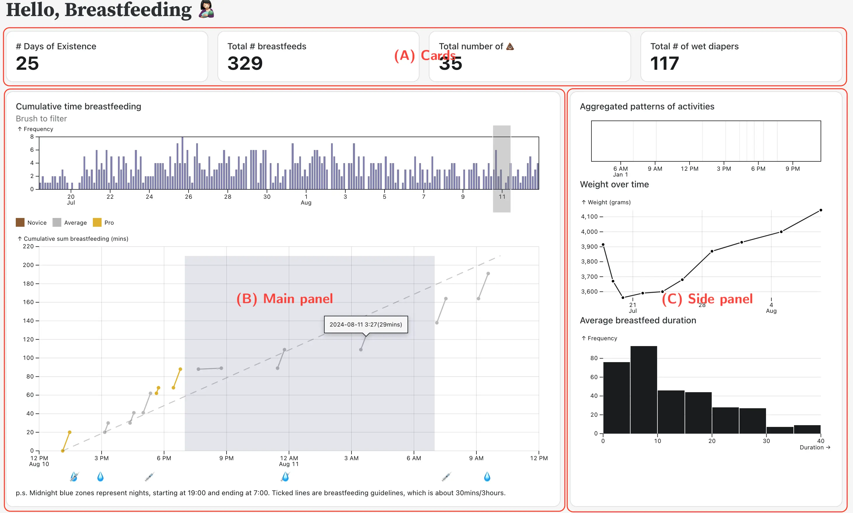
The main pannel shows the CBT, with the official breastfeeding guideline indicated by the diagonal dashline (30minutes/3hours, or 8 times a day, on average). The first and second dot of each link is start and end of a breastfeed. Since it is a cumulative sum, each link starts where the previous one ends. One can filter the time of interest by brushing the histograms at the top of the CBT plot.
At some point (on day 19th, I think), we witness our little girl gulping like never before. We realized how most breastfeeds before that day were, to be kind, below average. We represent this newly acquired information by awarding each breastfeeding with a color, with some olympic inspiration.
At the bottom, you can see emojis representing relevant activities. The syringes are extra-milk that I need to give to our baby to make sure she gainS enough daily weights. The droplets of water are wet-diapers. This is how we track if she gets deshydrated, which was a main concern in the heatwave of few weeks ago. Finally, the midnight blue zones are nights. I guess you can see we are lucky parents, as the long stretch without breastfeed at night is us getting sleeping (minus the time it takes to put her asleep).
The side pannel show aggregated data to get a global picture of the breastfeeding. The top plot shows the hourly aggregated activity. The hope would be that at some point some patterns, or routines, will emerge, facilitating coordination in our daily activites. The second plot is the weight. And the last plot is the average breastfeed duration, which we are interesting to see changes overtime.
We were also interested in the daily frequency of the different activities:
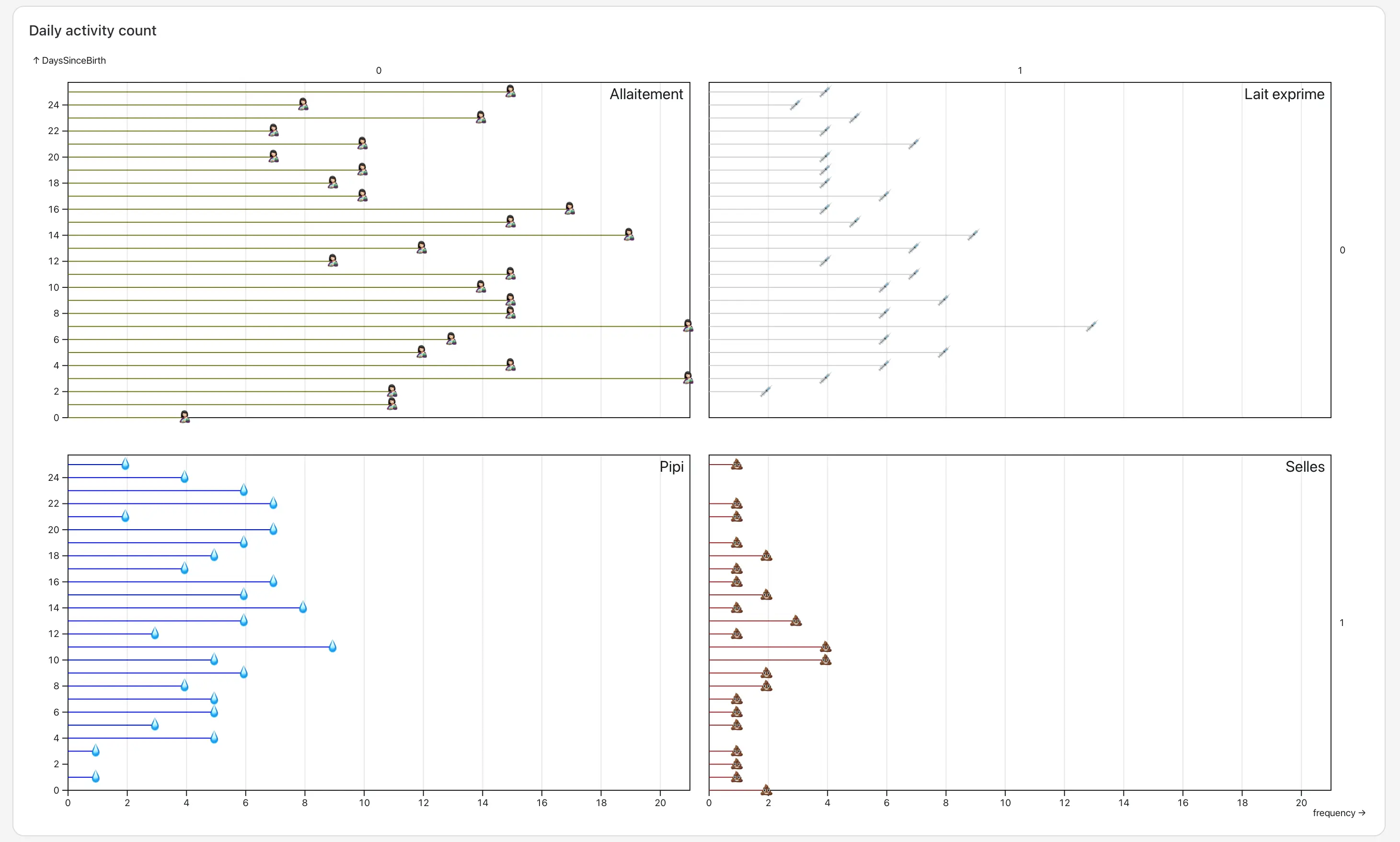
In particular, the number of breastfeed and syringes (milk supplement) were interesting to us.
This dashboard is dedicated to my partner, who did the pushing, breastfeeding, and data collection. Our midwives who were kind and reassuring in times of need. And the “Halte allaitement” who are offering us key insights on learning to naturally feed that child.
Thats it for now, I’ll add more information when I have time.